The short answer: Mobile-first indexing means Google uses the mobile version of your pages, crawled with its smartphone crawler, to index and rank them. Google announced in October 2023 that the move to mobile-first indexing was complete. If your site uses responsive design, your mobile and desktop pages are the same, and most of this is already handled. If your mobile pages show less content, different metadata or missing structured data, Google may only see the reduced version. The fix is to make the mobile version equivalent to desktop.
This guide is for business owners and marketers who want to know whether mobile-first indexing affects their site. It follows Google Search Central as checked in November 2026. Apzom Digital builds websites and sells SEO, so read this knowing we have an interest. Most checks take a phone and a few minutes.

What to take from this guide
- Google indexes the mobile version. What a phone sees is what Google uses.
- Responsive design is Google’s recommendation, because the content is the same on every device.
- Parity is the goal. Same content, headings, metadata, structured data, images and video on mobile and desktop.
- Separate mobile URLs need extra care, with the right canonical and alternate tags.
How mobile-first indexing works
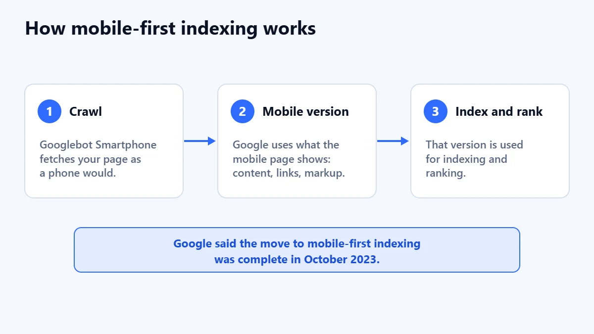
Google says it uses the mobile version of a site’s content, crawled with the smartphone agent, for indexing and ranking. It says a mobile version is not required for content to appear in results, but that one is very strongly recommended.
In its October 2023 announcement, Google said the move to mobile-first indexing was complete. It said a very small set of sites still did not work on mobile at all, for example by showing errors to all mobile users or blocking mobile crawling in robots.txt. It would keep crawling those with its older desktop crawler for now, and reduce that crawling over time.
Which setup do you have?
| Setup | How it works | What to watch |
|---|---|---|
| Responsive design | One URL and the same HTML for every device. Layout adapts with CSS | Google’s recommendation. Content and metadata are the same by design |
| Dynamic serving | One URL, different HTML depending on the device | Send the Vary: User-Agent header, and keep content equivalent |
| Separate URLs | A separate mobile site, often on an m. subdomain | Everything below, plus canonical and alternate tags |
Most WordPress themes, including the one this site uses, are responsive. If you are not sure, open a page on your phone and on a computer. If the address is the same and the content matches, you are almost certainly responsive.
What should match on mobile and desktop
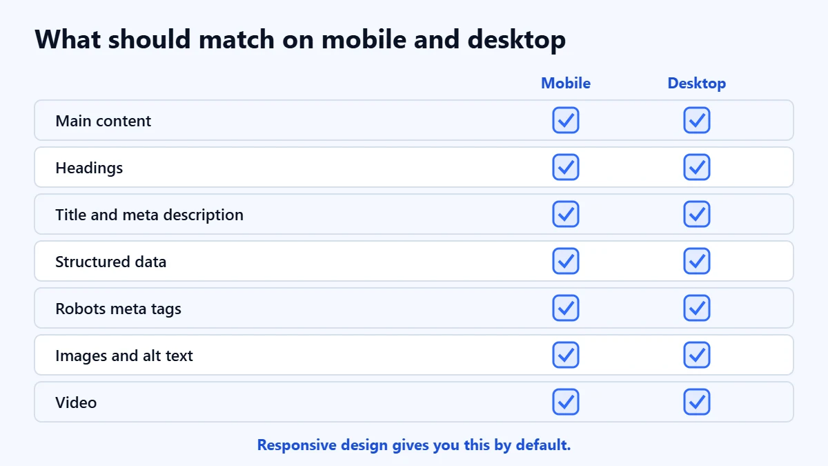
Google’s best practices for mobile-first indexing come down to making the mobile version equivalent:
- Content. The mobile page should have the same content as desktop. Google warns that less content on mobile can lead to a loss of traffic. Accordions and tabs are fine for saving space.
- Headings. Use the same headings on both versions.
- Titles and meta descriptions. Keep them equivalent. Our guide to title tags and meta descriptions covers writing them.
- Structured data. Use the same structured data on both. If you use separate URLs, the URLs in the markup should point to the mobile pages. Our guide to schema markup covers the basics.
- Robots meta tags. Use the same ones. A noindex on mobile only can remove the page.
- Lazy loading. Google says not to lazy-load primary content that only appears after someone swipes, clicks or types.
- Resources. Do not block CSS, JavaScript or images on mobile with robots.txt.
- Images. Use high-quality images in supported formats, with the same alt text, captions and file names. Avoid image URLs that change on every page load. Our guide to writing alt text covers the text.
- Video. Use supported formats and tags, the same video structured data, and place videos where they are easy to find on a phone.
- Ads. Google points to the Better Ads Standard and gives ads at the top of a mobile page as an example of a poor experience.
Is your mobile site holding you back? Ask for a Free Growth Audit. We compare your mobile and desktop pages, check speed and indexing, and tell you what to fix first.
If you use separate mobile URLs
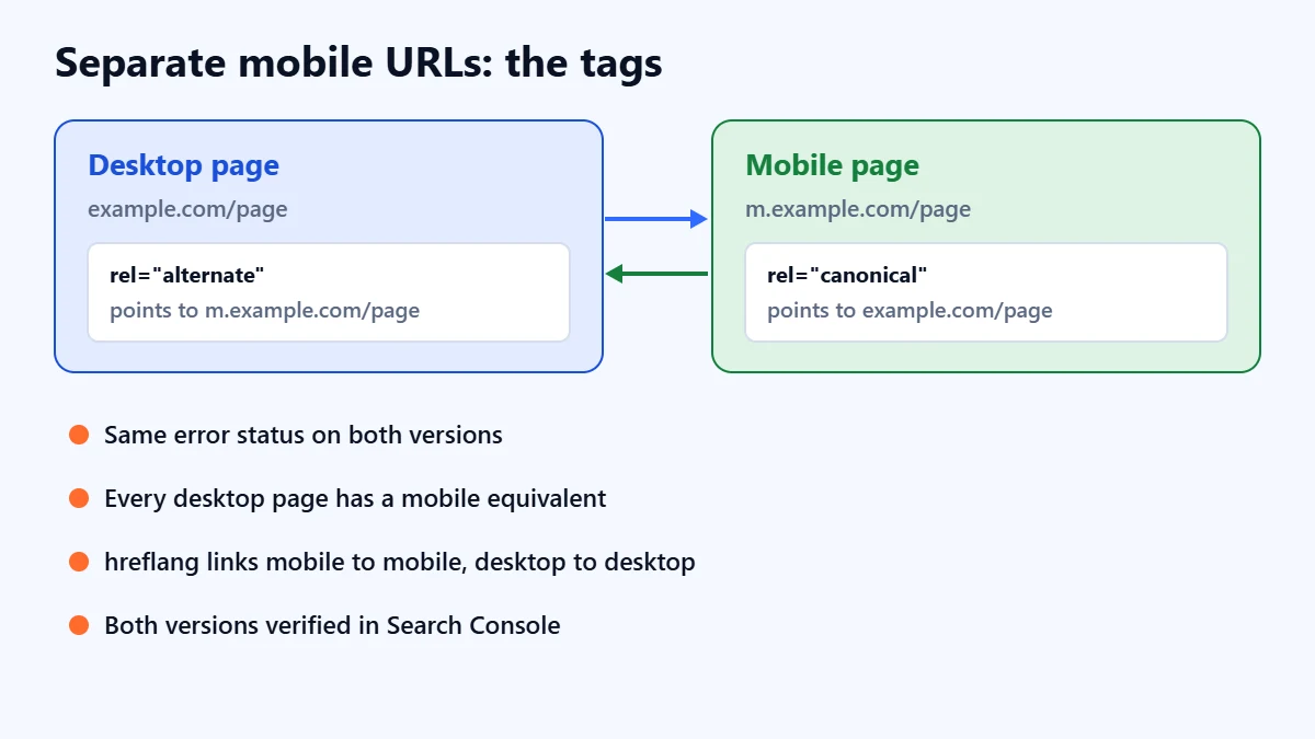
Separate mobile sites, such as m.example.com, need extra work. Google’s additional best practices include:
- The desktop page carries a
rel="alternate"tag pointing to the mobile URL, and the mobile page carries arel="canonical"tag pointing to the desktop URL. - Each page returns the same error status on mobile and desktop.
- Mobile URLs do not use fragments.
- Every desktop page with its own content has an equivalent mobile page. Redirecting many desktop pages to one mobile page, such as the mobile home page, removes them from the index.
- hreflang links mobile pages to mobile pages and desktop to desktop. Our guide to hreflang explains the tags.
- Both versions are verified in Search Console.
- robots.txt rules are usually the same on both, and the mobile server can handle more crawling.
In our judgement, if you are already planning a redesign, moving to responsive design removes this whole category of problems. Our website redesign SEO checklist covers how to do that without losing traffic.
How to check your site
- Compare on a phone. Open your key pages on mobile and desktop and check that the content, headings and images match.
- Use URL Inspection. In Search Console, run a live test on a key page and view the tested page to see what Google’s crawler renders.
- Check Crawl stats. Google’s 2023 announcement points to the Crawl stats report, under Settings, to see how your site is currently being crawled, including by which Googlebot type.
- Compare the source. If you use dynamic serving or separate URLs, compare titles, meta descriptions, structured data and robots tags on both versions.
A checklist
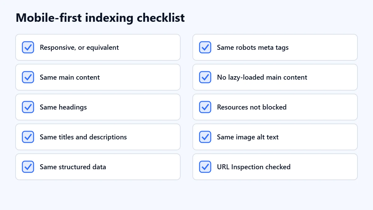
- Confirm your setup: responsive, dynamic serving or separate URLs.
- Check the same content and headings appear on mobile.
- Check titles and meta descriptions match.
- Check structured data and robots meta tags match.
- Make sure primary content is not lazy-loaded behind a tap or swipe.
- Make sure robots.txt does not block mobile resources.
- Check images use the same alt text and stable URLs.
- Run URL Inspection on key pages.
Mobile speed is a separate topic. Our guide to Core Web Vitals covers it.
Frequently asked questions
Do I need to do anything for mobile-first indexing?
If your site is responsive and shows the same content on every device, usually not. If your mobile pages hide content, metadata or structured data that desktop has, make them equivalent.
Is mobile-first indexing the same as mobile-friendliness?
No. Mobile-first indexing is about which version of your page Google uses. How well a page works on a phone is a separate question of user experience.
Can I hide content in accordions or tabs on mobile?
Yes. Google suggests accordions and tabs as a way to keep the content while saving space. The content still needs to be on the page.
My site does not work on mobile. What happens?
Google said in 2023 that it would keep crawling such sites with its older desktop crawler for now, but reduce that over time. In our judgement, fixing the mobile site should be a priority.
Get your Free Growth Audit and Quote. We review your mobile experience, indexing and technical SEO, then send a plain-English list of what we would fix first.
No obligation and no guaranteed rankings. Prefer to talk first? Contact us or see our website development service.